Behind the Design: Modern Classic Home Office
The home office at our Modern Classic Home Project is one of our favorite room transformations. In our new “Behind the Design” series, we will take you behind the scenes to show the design process and how we took a basic space and turned it into a stylish and functional home office.
Before
Our client wasn’t a fan of the wallpaper or light fixture in the space. When they bought the house, there were a lot of farmhouse and floral elements. Nothing entirely wrong with that, just her style. Throughout the project, we worked to update the home to a “Modern Classic” design aesthetic and to make it feel like their home- not the previous owners. So, wallpaper and existing light fixture were on our list to go. The back wall was the perfect spot to create a built-in desk that would give our client a larger work area with more storage.
Before
After seeing this space, I envisioned a chair in this corner. I always like having different seating options in a home office if the layout allows. A cozy reading nook would be perfect here.
Before
Design Inspiration
Once the design process began, we got to work pulling inspiration images of offices and storage solutions that would work in the home office. From a design perspective, we liked the idea of doing a deep blue color throughout the space. We also wanted to mix in some white oak shelving for storage and to lighten up the look above the desk area.
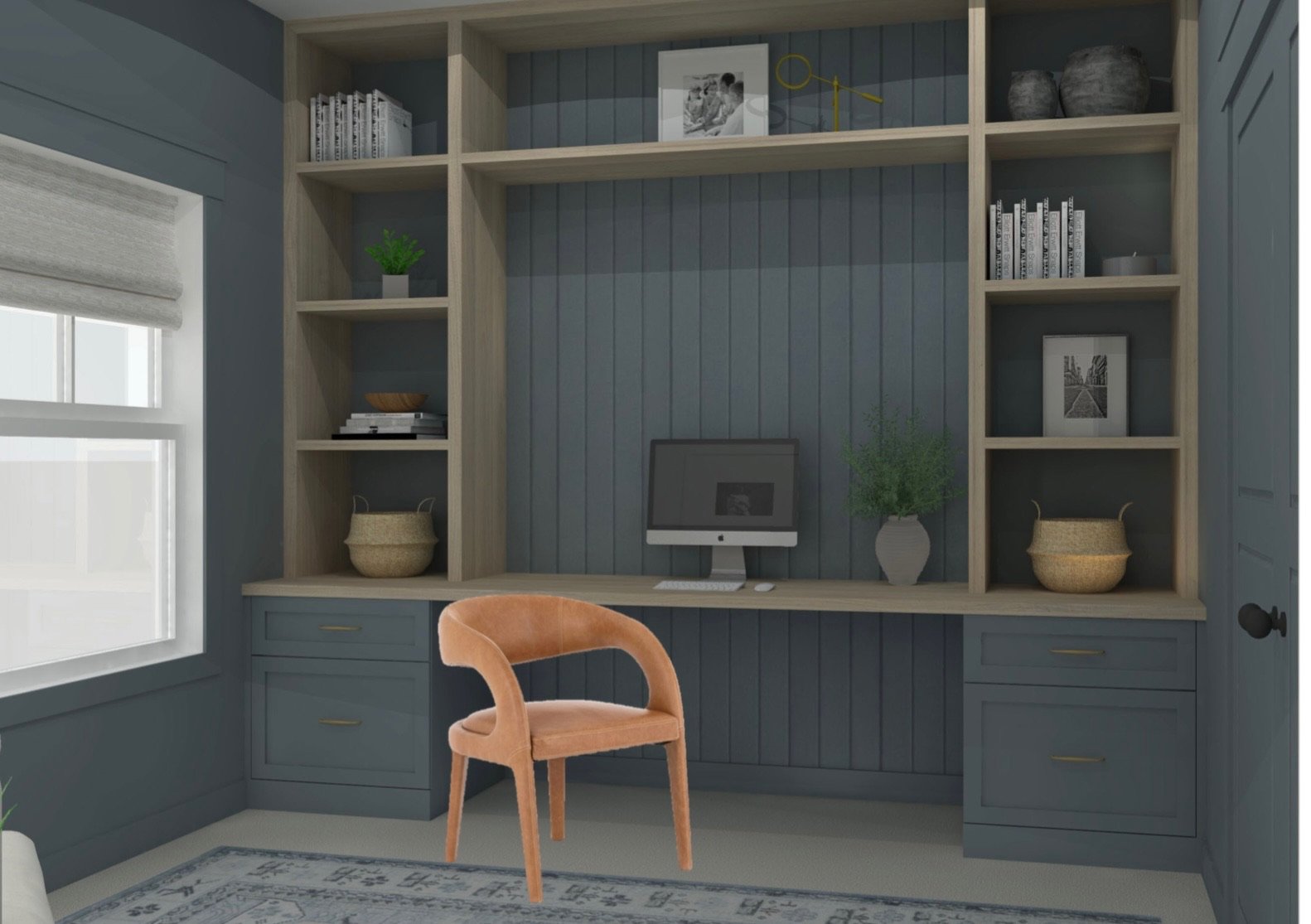
Office Built-In Desk Rendering
We always love a built-in going to the ceiling. It makes the room feel so much bigger and taller (plus, no dust accumulating at the top). The bottom drawers of the desk was designed to accommodate hanging files. Vertical shiplap was used for visual interest in the center of the built-in desk. We also opted to go with a leather dining chair instead of a typical desk chair.
Office Reading Nook Rendering
We planned to paint the walls, trim, and doors all the same color. Since everything was going to be so saturated with color, we opted for a lighter color chair to go in the corner. The large white frames take up space and give a little visual break from all the blue.
Office Design Board with furniture, lighting, and accessory selections.
Layering rugs in areas where you just have wall to wall carpet is a great way to bring color, pattern, and texture into the space (while breaking up the sea of beige carpet). We also use rugs to anchor a space and to define the area. This rug tied the colors in perfectly and is one our favorite pieces in the space. Additionally, we designed the office to have brass accents such as lighting and hardware.
Floor Plan and Elevation drawings of desk built-ins
Once the design was presented and approved by the client, we created plans and elevations to communicate the design to our cabinet maker. We specify the dimensions and callout any important notes to review with the cabinet maker.
Progress Photo showing interior wall and trim paint
Benjamin Moore: 1645 Thousand Oceans
Trim- Pearl/Satin Finish
Walls- Matte Finish
While we were waiting for the cabinets and furniture, the room got painted. When doing the same color for walls, trim, and doors, it’s good to use a different paint finish from the walls and doors/trim. For walls, we typically want a matte finish to create a velvety look. The doors and trim were painted a Pear/Satin finish that give a little more shine and durability.
After
We absolutely love how this space turned out (and our client does too!). The light pouring into the room is so beautiful in this shot. Even though the walls and cabinetry are dark blue, there is still a lot of natural light in the space.
After
Once the built-in was installed and furniture was delivered, we can back to style the room. We always like mixing in plants, books, vases, and other decorative objects for visual interest.
After
This chair is even cozier than it looks! We added a little pop of color with the lumbar pillow, but otherwise kept this corner fairly neutral. We love black & white photography and bringing in photos with special meaning to our clients. Featured is our client’s dog, Waffle, who is the sweetest and I love that he is represented in the space.
And with that, the office transformation is complete. What other behind the scenes content would you be interested in seeing? Let us know in the comments!
Have a space that needs a transformation? Click the link below to inquire and to tell us about your project.
FOUNDER + PRINCIPAL DESIGNER


